


The Hidden Magic: How Light and Color Transform Your Look, Part 2
I recently got an app on my phone that promised to give me an amazing color analysis. I thought, "Surely, they've made advances by now!" After paying over $35 to try the app, I was shaking my head...

In Part 1 of this story, we discussed how light works with the molecules of the skin to make us look luminous (or not luminous). In this part, we will talk about how the colors we wear next to our faces affect the way light behaves, changes, and is perceived by others.

But first, a little story about my adventures with color analysis phone apps. I realize we can all be suckers for those VERY confident claims made by people who invest thousands (I MEAN THOUSANDS) of dollars in developing apps or systems that promise to make things into super simple, one-size-fits-all hacks or cheats. It’s like our very own “EASY” button. Well, it’s no different for apps that purport to tell us what colors and styles to wear. Seems legitimate, right?
So, as I stated, I tried some out, and let me tell you, their recommendations were far from flattering. When I wear the wrong colors, it ages me and makes me look tired! I come alive in royal blue, crisp amethyst, or juicy plum. But, with their color recommendations from the autumn season of avocado green, dusty teal, rust brown, and the like, I was truly disappointed.
I was also, once again, disappointed in the fact that color analysis and image consulting have not evolved much at all for decades. They use “matchy” AI color coordination (they call it harmonizing) voodoo and tell you one of the myriad color seasons. They ask a few questions about your lifestyle and personality and send you to a bunch of affiliate retail sites to buy clothes that will never look good on you because the approach is flawed from the very foundation: they use superficial coloring rather than undertone as the deciding factor in their recommendations.
“Well, when you put it that way, I don’t think it sounds too good!” you might say. The problem is that they don’t put it that way. The fashion industry is great at getting people to buy things. I’ve shied away from recommending things for a really long time because, personally, it takes me much time and effort to find pieces to add to my wardrobe that I absolutely LOVE. So, I have no idea what YOU would absolutely LOVE. I scout high and low for just the right colors and styles that flatter my own skin and body because I know the rules for my face and shape. Plus, I have a wardrobe that reflects my personality and lifestyle. I feel like clothing is such a personal choice. The messages I AM trying to convey are simple though: 1. If you wear the wrong colors next to your face, it can age, discolor, and cast shadows on the look of your skin. 2. DRESS UP! Please don’t spend your life in drab colors and unflattering styles. You can look and feel so lovely every single day. WHY NOT DO IT?
I have never met another stylist who was more personally empowering than my mentor, Sandy Dumont. I took over her life’s work, The Image Architect, in 2019. Because of COVID and the rapid changes in lifestyles and fashions in the past few years, I rebranded to create more holistic content. I am more centered on lifestyle, wellness, empowerment through education, and yes, on the way light/color affects us. For clothing and wardrobes, I write about becoming less emotional and more technical about finding pieces that truly flatter us. I want to help people find those pieces they want to hang on to long-term rather than constantly having to “run on the trendmill” (article coming on that too, soon!)
The themes that I discuss aren’t viral fashion tips on what to buy today, so you can do it all over again in a few weeks, or cult pieces by luxury designers so we can relieve our FOMO (believe me, you can find plenty of material on that out there). I believe it’s important to spread the message that the colors most people are probably wearing right now are very likely not in line with their undertone. In addition, I know the results of those in-person technical color analysis sessions. They show that no matter our tan shade, race, personality, eye color, hair color, or other factors, undertone is the factor that is most important to consider. This is because light and colors interact with our facial coloring. Clashing colors, such as when our skin is cool and we wear a warm-toned shirt next to the face, can do funny things to our facial skin.
Ironically, the app in question was able to discern that I do have cool undertones. However, because the algorithm did not use undertone as the primary factor in the color palette and clothing recommendation, it was a waste. I spent money, thinking I would get valid clothing recommendations, only to be sent to a page to spend more money to buy unflattering things I neither want nor need.
That's not the “EASY” button I need in life. The saddest part of all? The reviews in the App Store are very favorable. It never fails to amaze me how many people buy into the false harmony, color matching, and “this feels so harmonious” BS theories about what colors we should wear. It doesn’t help that most people are told that we need to match our eyes (which literally does nothing to help us look better) and hair color (which was also probably chosen based on trends or “the heart”).
"In nature, light creates the color. In the picture, color creates the light."
~Hans Hofmann
A Word About The 16,000 In-Person Color Analysis Sessions
After testing over 16,000 clients and doing much research, we can attest to these things:
80%+ of the human population, regardless of nationality, race, gender, mood, personality, geography, or any other factor, were found to have COOL undertones.
Undertone is the sole factor in determining the colors that make facial skin look good (i.e. luminous, smooth, radiant)
If your skin doesn’t look good, it doesn’t matter if your clothes, hair, and eyes are all vibing/coordinating with the most amazing harmony ever. You’ll still have consequences and often look older, more washed out, and depending on the color, possibly even less healthy (i.e. yellowish, pale).
Do you still think that hair and eye color should be used? Maybe personality traits?
None of the superficial factors will ever change how colors next to your face interact with the look of your face due to the fact our skin is a collection of molecules that interact with light to make us look a certain way. Again, see Part 1 of this story right here:

But For Now, We Shall Proceed To Our Nerdy Color Lesson Of The Week
"The best color in the whole world is the one that looks good on you."
~Coco Chanel
Let’s bring up our friend with the orange and blue shirts again.

Ok, let’s break down what’s happening here. What do you see in the left picture with the orange shirt? If you relax your eyes and look at the whole picture from a zoomed-out perspective, you can see that your eyes begin to harmonize the face and shirt for you. Do you get that effect?
Some people (stylists and color analysts too) think the orange shirt looks more harmonious. They would type this person in the Autumn category like the app did me. The problem is obvious if you know how this all works. You see, colors don’t just stay put when they’re next to things. The reason the shirt might appear to be harmonizing with the face is that our eyes are trying to compensate for the clash.
They do this by casting an orange tinge on certain parts of the face (cheeks, nose, hairline). Do you see it? I don’t know about you, but I don’t want a yellow or orange tinge on my face. Also, because the woman’s undertones are cool, this warm/orange tinge causes clashing on the face, thereby distorting the light that would otherwise be reflected.
Try this technical color analysis party trick as a demonstration: Here are three colors. In the middle is a red color that will demonstrate how colors affect the colors next to them. If you use a piece of white paper to completely cover the orange square to the left, the red takes on a cool-toned, cherry-red tone. On the other hand, if you use that piece of paper to cover the purple square to the right, the red immediately harmonizes with the orange and becomes a warm-toned, tomato-red.

If that wasn’t bad enough, however, because this orange is a very saturated shade, our eyes compensate for it by casting a strong dose of the color opposite it on the color wheel (based on the spectrum of colors) onto the face to tame it (beauty’s in the eyes of the beholder, right?)
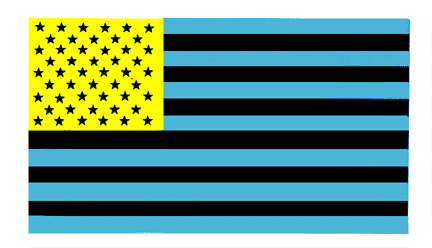
Here is another trick we have likely all seen before: The American flag optical illusion is an experiment that uses optical chemistry and neurological confusion to create an image of the American flag. The illusion works by causing your eyes to see the opposite colors of green and orange, which are red and blue. You know colors cause us to see the colors opposite themselves on the color wheel to create balance because when you look away from the flag, you’re still seeing it for a bit. This is because different visual receptors are stimulated, and the information from all of the different color receptors is not in balance.
Cover one eye, then stare at the center of the flag for one minute. Keeping the other eye closed, quickly look at a white background (like a white wall or if your screen is white next to the flag here). What do you see? You should see a red, white, and blue US flag. This happens because your eye reverses the colors in afterimages to mitigate retinal fatigue. Try it for yourself if you like, and let me know if it works for you.
Here’s a bonus one. Same idea as before, or try it with both eyes. Stare at the black dot on the red pitcher for a minute, and then shift to the dot on the left. Now you’re seeing the same pitcher but in a different color. What color is opposite red?

Let’s bring that all home by circling back to our friend in the orange and blue shirts: Our eyes try to compensate for colors by casting opposite colors to mitigate retinal fatigue. The color opposite orange on the color wheel is blue. And what does blue do? It’s often considered an optic whitener. (Same idea as using purple shampoos to mitigate yellowing hair, etc.) Blue literally bleaches us, making us look more pale. But our eyes don’t care. They’re done reconciling the orange shirt, and these are the results: less even skin tone with orangey spots, an overall washed-out appearance because of the blue hue cast by our own eyes to tame the overall strong orange color (and thereby mitigate retinal fatigue), and less luminous glow because there is so much going on to compensate for the clashing colors. I’m out of breath just re-reading all those bad results, but alas, that’s the length of sentence it takes to tell the bad news.
About the blue shirt though: Since this woman has cool undertones (defined by bluish/pinkish tones in the skin), she does not clash with the blue shirt on the right. In fact, when our eyes cast the color opposite of blue onto the whole of her face, they’re casting a nice, flattering rosy color that makes her face look healthier and more radiant. Not everyone likes this vibrant blue (or any such bright color), but technically, this color does LESS to take away the luminosity of her skin. The orange gets in the way of light and the blue enables the light to flow more readily. The blue is a clear winner for this woman’s undertones, and therefore, regardless of the eye or hair color, she generally looks better in it.
So, you see, your eyes play tricks on you!
If you’re a color nerd like me, please feel free to swipe Chapter 2 from Sandy’s Color Me Correctly, Please book. It’s all about color. It’s attached below for paid subscribers. If you can’t see the download and you’re a paid subscriber, be sure to login to the Substack app.
Please check out the navigation bar on Substack for notes and other content, as I’m always adding.
And until next time, always take a little extra time to help yourself shine.
Love, Tatyana
P.S. If you sponsor this publication as a founder, I will send you any ebook I have from the former Image Architect materials as I’m still sorting through content. Just send me a via direct messages or the Light Loves Color chat. Remember, Substack is a reading and writing community. I chose it because I really want to give you the most, so be sure to ask questions and let’s help one another.
Keep reading with a 7-day free trial
Subscribe to Light Loves Color by The Image Architect to keep reading this post and get 7 days of free access to the full post archives.