


The Secret Language of Light and Color and How They Speak To Us Even When Our Eyes Are Closed
In this week's article, we discuss how light and color make a profoundly deep impact on our emotional and psychological states.

Hi, it’s Tatyana!
I’m back from a long weekend getaway to the gorgeous Pacific Northwest with my husband, 4 kids, and our dog Dixie. We stayed at a little Airbnb on a lake. The kids stayed busy playing in the hottub and lake and hubby and I got some much-appreciated respite. We’re so thankful that my sister, who is a nurse, watches my adult handicapped brother for us on occasion so we can do things like this.
After my family immigrated to the US from the Soviet Union when I was 10, we spent 7 years in a tiny town on the Olympic Peninsula. It’s a land full of wonder and majesty. I finally got to take my own family there for some exploration and sightseeing. I also introduced my family to a few wonderful people who helped my refugee family get established. We obviously became lifelong friends.


Have you ever been to this part of the country? I absolutely love it and end up trying to replicate the greenery in my own yard, but it is so hard without the extra rain that they get in the PNW.
In the article for this week, I wanted to explore how “real” color psychology was. I was pleasantly surprised by the studies that illustrate how light and color affect our brain chemistry and emotional centers.
Enjoy and stay in touch! I love hearing from you.
Tatyana

"I found I could say things with color and shapes that I couldn’t say any other way—things I had no words for."
Georgia O'Keeffe
Look your best on video calls in 3 ridiculously easy steps:

1. Turn on the lights
Whether it’s a ring light or natural light from a big window, light will give you some big benefits. Darkness and shadows naturally age us and take away our glow, so don’t forget to prop yourself up in a nice, bright place.
2. Respect your undertone
Last week, I illustrated how the wrong colors confuse the eye and cast shadows and different tints right onto our faces. If you’re in the 80% majority of people with cool undertones, be sure to pick a top and background that complement your cool undertone. Once you know what to look for, you will see that almost all colors come in warmer or cooler tones. Even a color that’s usually considered cool, such as blue, can be more cool or it can be more warm, yellower. Of course, if you’re in the warm undertone camp, a top that will make you look best will have warm tones.
3. Brighten your look!
Even a quick video call with a sister, a long-time friend, or the grandkids makes a lasting impression, especially if you haven’t seen one another in a while. The colors that will make you look the most energized and vibrant are saturated, bright hues. Just look at these two screens. Which person looks the most energetic and lively?

Maybe grey is too obvious? Let’s try a common color like this mossy green:

This illustration was one of the first illustrations Sandy Dumont did during the extensive in-person Image Consultant certification course I took at her Impression Strategies Institute. I found it impactful that even if there is no face on an outline of a person, the colors of their clothing speak to us and tell us if he or she is tired or energetic, inhibited or outgoing.

The Secret Language of Light and Color and How They Speak To Us Even When Our Eyes Are Closed
Many people love color psychology. I’ve generally accepted that different shades of color elicit different emotional and psychological responses. On a basic level, we know that a soft color such as soft pink, beige, baby blue, etc. will have a lot less “threatening” connotation. These are less powerful, authoritative, and intimidating. You would wear those if you got a summons to court for going 75mph in a 35mph zone to plead with the judge that you’re not a threat to society.
We also know that business suits aren’t made with those colors because they can be seen as wimpy in certain situations. Imagine, for example, you’re representing a medical tech company and trying to convince a billionaire VC investor that you can be trusted with her investments. You want to look authoritative and powerful in that setting, so they will instantly have more confidence in your abilities to get things done.
BUT, I also felt that some people treat colors with a pseudo-scientific approach that comes across as made up. Either there is science to something or I don’t tend to write about it. I don’t believe all scientists either. If even a minute detail of a study is based on assumptions or unverified claims, I don’t accept it as scientific simply because I’m not sure what I can truly write about it.
I wanted to know just how much of this color psychology stuff was even studied and taken seriously by scientists, and if any of it was worth my time. I wanted to know it wasn’t all just the illusions of some mystical daydreams. More importantly, I wanted to know how it worked. What exactly is the mechanism for color to affect us at all?
My approach was to investigate whether colors can elicit any of the stated effects even when our eyes are closed. If they could do even a little bit, I thought, then there must be some way they diffuse light and the energy that emanates from light. It turns out there are some pretty solid studies that explain the effects and how it all works:
First, Yes, Light Does Have Observable Effects
Effect on the Pituitary Gland: The pituitary gland, which plays a crucial role in regulating various bodily functions, can be affected by light exposure. Specific wavelengths of light can influence the secretion of hormones, thereby affecting body temperature, sleep patterns, and metabolism. These changes can occur without direct visual perception of the light (Psychology Today).
Autonomic Nervous System Activation: Light exposure can stimulate the autonomic nervous system, leading to physiological changes such as increased heart rate or relaxation. Colors like red can activate the sympathetic nervous system (arousal), while blue can stimulate the parasympathetic nervous system (calming) (Frontiers).
Subconscious Processing of Light: The brain can subconsciously process light information even when the eyes are closed. This processing can affect cognitive and emotional states by modulating brain regions associated with mood and attention. For instance, red light can enhance alertness and cognitive performance, while blue light can promote relaxation and improve mood (Cambridge).
Psychological Association with Colors: Colors are associated with specific psychological responses due to cultural and physiological factors. For example, blue is often associated with calmness and stability, while red is linked to excitement and urgency. These associations can trigger corresponding emotional responses even when the light is not directly seen but sensed through closed eyelids (Psychology Today).
How Light Penetration and Diffusion Work Even With Eyes Closed
Penetration Through Eyelids: Light, including colored light, can penetrate the eyelids and reach the photoreceptors in the retina. This is particularly true for wavelengths of light associated with colors like red and blue, which can influence brain activity and physiological responses. Even with eyes closed, light can diffuse through the eyelids and stimulate the retina, sending signals to the brain (Frontiers) (Cambridge).
Diffusion in Tissue: Light diffusion through the eyelid tissue can lead to subtle activation of the visual pathways. The brain processes these light signals, which can result in changes in mood, alertness, and other psychological states (Psychology Today).
Studies Showing Observable Psychological Responses
Physiological Responses to Color: Research has shown that color stimuli can influence various physiological responses. For instance, exposure to red light has been associated with increased heart rate and arousal, while blue light has been found to have calming effects and lower heart rate and blood pressure. These effects occur because colors are light waves of different lengths that can penetrate the eyelids and stimulate the brain even when the eyes are closed (Frontiers) (Psychology Today).
Impact on the Brain and Body: Colors can affect the pituitary gland, which regulates body temperature, energy levels, sleep patterns, and metabolism. This suggests that color exposure can influence these physiological functions without direct visual perception (Psychology Today).
Emotional and Cognitive Effects: Studies have indicated that colors can affect mood and cognitive performance. For example, viewing red can increase memory for negative words, while green enhances memory for positive words. This implies that color can modulate emotional and cognitive states even without visual awareness (Cambridge).
Experimental Evidence: Empirical work has shown that colors like red can enhance alertness and attention, whereas blue light can improve performance on attention-based tasks. Such findings highlight the broad impact of color on psychological functioning, including when visual perception is not fully engaged (Frontiers) (Cambridge).
So, as you can see, there are some studies that show color works with light to have a variety of effects on our bodies.
Here is a basic review of some of the colors and the effects they elicit for the next time you want to change up the vibe of a room or to elicit a certain psychological response.
Sandy Dumont’s Color Psychology Basics
Red
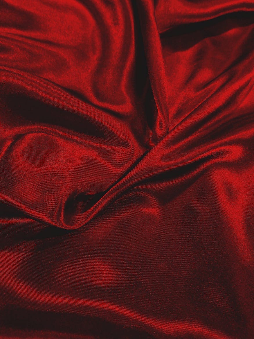
Red is the color of assertiveness, enthusiasm, spontaneity and courage; conversely, it is also the color of aggression, impatience, anger and recklessness. Red is the pioneer, and it represents energy and growth.
It is perhaps the most dominant color that exists and universally represents action. It can physically increase the blood pressure temporarily and also stimulate the appetite. The red-checked tablecloth has been associated with restaurants for years, and no wonder.
In the Luscher Color Test, red represents one of the four fundamental psychological needs: the need to assert oneself. Thus, it is the “I want to be me” color. Athletes tend to like red, and in childhood, it is often the preferred color. Under red lights, objects are judged to be bigger as well as heavier.
Spanish bulls are after the matador’s cape, not the matador. And that brings up another point: choosing colors for the occasion.
For instance, it might not be a good idea to wear red when you know you will be encountering an argumentative or aggressive person. Red incites in both positive and negative manners, and it could easily provoke an aggressive person.
Some insurance companies charge a higher premium for red cars, and it is likely that driving and staring out at a splash of red could incite some drivers to drive faster or more recklessly.
Interestingly enough, croupiers at gambling casinos often wear red, since it is a color that can stimulate a person to take a risk or to act in an impulsive or excitable way.
Blue

People typically perceive blue as a spiritual color as well as a business color. This may seem contradictory, but not when you take a closer look at the origins of these two messages. Most gods known to mankind are pictured in the heavens above, which are blue.
Likewise, when we strive for success in business, we reach for the sky, the stars, or the top of the mountain, all of which symbolically lead the eye up to the blue sky. Blue, thus, represents high aspirations in general.
The expression “True Blue” also explains the inherent loyalty that the color BLUE emits. For years, IBM salesmen were encouraged to wear a navy blue business suit and a white shirt, and it is for good reason.
Blue denotes trust, while white implies purity. Could it be a coincidence that IBM’s dominance began slipping as they departed from their famous authoritative “uniform” and started letting their employees dress like everyone else?
Dark navy blue is a particularly authoritative color, so not only policemen but also airline and ship captains wear navy blue uniforms.
On the negative side, blue has an association with passivity, and has inspired such expressions as “blue Monday” and “feeling blue.” This is primarily true of paler and grey-toned shades of blue, as they are particularly passive.
Dark shades of blue can represent aloofness and coldness, and we speak of. “turning blue” from cold. Some shades of dark blue, primarily those with grey undertones, can also signify a gloomy disposition.
Black
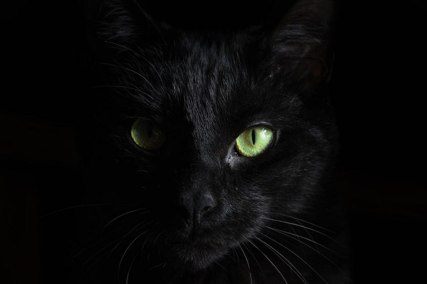
BLACK is a complex color. It can denote danger, withdrawal, or non-conformity. Darth Vader and countless other black-clad villains elicit immediate danger in the movies, as do their real-life counterparts like the Mafia and the Gestapo.
There is also another “danger” that is symbolized by black. Consider the “little black dress.” It has always had a reputation for being alluring or sexy, so the “danger” signal was being sent out loud and clear by centuries of Femme Fatales who knew that black could also be exciting. The male counterpart shows up in black tuxedos and black-clad figures such as Zorro.
Black also symbolizes withdrawal, as when one is in mourning. It has also been noted that when black is worn to the exclusion of all other colors, deep depression is likely, and depression leads easily to withdrawal.
Withdrawal easily slides into non-conformity (withdrawal from the “rules” of society), and that is the message being sent out by modern-day punks.
Jazz musicians and beatniks from the fifties also donned black as a symbol of their unwillingness to conform.
Priests who don black with a white collar are sending out two messages. First, their celibacy, or “withdrawal” from the marriage state; and second, the black-and-white issue of good and evil.
Judges in their black and white attire are alluding to their judgment as to whether or not a person is guilty or innocent, a literal good/evil issue.
The darker the color, the more authority it commands, and black is as dark as you can get. For that reason, it easily goes over the top and can elicit fear along with authority.
The authority of judges and priests goes unquestioned due to their predominantly black attire, but the white collars suggest their innate purity.
Puritans, incidentally, wore black and white. Without a doubt, black symbolized austerity and white symbolized purity.
Grey

Grey is a mixture of black and white, and it is a neutral color in that it does not communicate any specific message.
In fact, a ‘grey area’ in a situation or report suggests that it is vague or unclear. Thus, it is a good color to wear when you don’t want to make an obvious statement.
Politicians often wear grey so as to appear neutral on issues. However, without knowledge of image skills, they often end up looking passive or weary.
Grey is a transition color and is often worn by those who are in limbo. It is not an action color, so it can sometimes have an old-fashioned connotation. Grey can also be Puritanism and thus imply stuffiness.
Grey is the only color that is literally born “negative.” For example, neither a grey day nor a grey mood has a favorable connotation. W
e speak of “old and grey” as well as “tired and grey.” In the theater, grey denotes sadness. Grey often indicates weariness, scarcity, austerity, melancholy, and illness.
We speak of a grey pallor when someone is ill. A few specific colors can undo the negative message that grey sometimes transmits.
Grey comes in both Warm and Cool versions, and mistakes can easily be made without careful examination in good light.
Warm greys have subtle yellow tones that are not necessarily visible, but they can generally be described as looking slightly different than classic grey.
Think about a grey that has oxidized with age and you will envision a Warm grey.
Your hair color can be a factor in deciding whether or not to wear grey. Mousy brown hair, for example, can look even “mousier” next to grey.
Grey clothing can emphasize the few grey hairs on someone whose hair is just beginning to grey. On the positive side, it can tone down the brassy gold tones in blonde hair.
Some men can have a five o’clock shadow at nine in the morning when wearing grey.
Most people have one grey that is better than all others, and the deciding factors can be hair, eyes, skin color, or persona.
Brown

Brown suggests “earthy”, and, consequently, a nurturing nature. It is more likely to suggest country weekend than office attire.
For men, it suggests the fatherly type, and it can conjure up images of brown-clad monks.
For women, it suggests the motherly type; and in extreme cases, it can look matronly. Because of its sporty or casual connotation, it is not a good color for business dress, except in the Midwest or rural areas.
Brown is intrinsically non-threatening, so it is a useful color to have in your closet if you are a human resources director and must occasionally fire an employee. It suggests “cry on my shoulder,” rather than “resent me” with my good job and navy blue attire.
A psychiatrist friend of mine noted that his clients opened up to him when he wore brown, but were reluctant to talk when he wore navy blue.
Of course! Mother Earth or Grandpa (brown) is easier to talk to than a “business executive” (navy blue)!
Brown should be chosen with great care, and those with predominantly grey hair should avoid it because it causes the hair to look mousy.
The most flattering brown for business dress is a very dark brown that resembles an Italian-roast coffee bean.
Next to the chocolate brown of Autumn, it will appear to have strong grey-black undertones.
Green
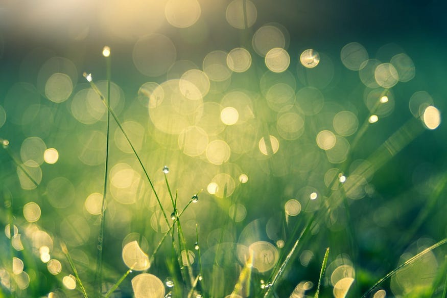
Green suggests coolness, like mint or the coolness one feels in a forest. It is a color that calms the nerves, and it helps reduce muscular tension.
Green is balance, and it is situated at the dividing point between Warm and Cool colors.
Green is said to be a healing color, and it is often used in hospital rooms and operating rooms. As it also represents growth, it would not be used in the cancer ward.
Many of the founding fathers of America were involved in the metaphysical. They knew that green represented growth and chose that color for the US currency. Dark racing green is said to be a color particularly favored by the upper classes.
According to Luscher, green represents self-preservation, as opposed to attack and conquest, represented by red. It is no coincidence that red and green are opposite each other on the color wheel.
When negative, green represents jealousy, and we speak of being green with envy. A greenhorn is one who is inexperienced and awkward, and being green implies being unskilled or untrained.
Green is a good color for physical therapists since it reduces muscular tension. Green represents emotions, so it is also a good color for psychotherapists who wish to get into the realm of emotions.
Yellow
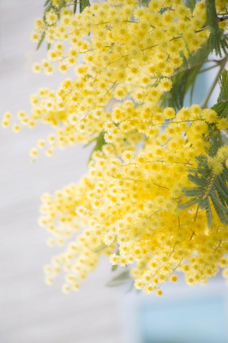
Yellow is associated with mental activity. It is a very bright color, and intelligent people are said to be bright.
Jittery or “hyper” types may find that it can easily create nervousness or anxiety. Butterflies in the stomach (yellow ones without a doubt) tell of the nervousness of yellow.
Yellow catches the eye immediately, and because of its high visibility, insurance companies have noted that fewer accidents occur with yellow cars than with any other color.
Unlike red, yellow maintains its high visibility even at night, and because of this, some cities started painting their fire engines yellow instead of red. In the theater, yellow denotes joy.
Highway warnings are often presented on a bright yellow background with black lettering so that the high contrast of black and yellow makes the yellow even more visible. Industry also uses this highly visible color combination to announce hazards. Railroad crossings are traditionally yellow and black.
Nature uses this ‘warning’ color combination with bumblebees and wasps. Yellow is an excellent accent color, but I have noticed that it is the one color to which a number of people will have an aversion.
Negative yellow is gossip, and we speak of yellow journalism. A coward is said to be yellow. Dark yellow is almost always negative because its light has been snuffed out by the addition of black.
Orange
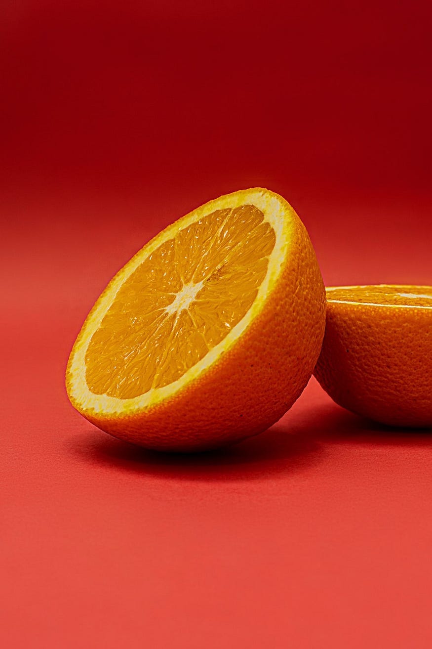
Orange is a combination of red and yellow and has qualities of both. Red tends to stimulate physically, while yellow stimulates mentally; thus, orange is doubly stimulating.
Fast-food restaurants often choose orange decor, and for very good reason: orange has enough warmth to attract, and it stimulates the appetite as much as red.
However, it is so stimulating that it is considered “unrestful,” and most people do not want to linger in its presence.
Orange, like red, suggests warmth and is symbolic of the sun. As such, the color has highly positive vibrations and holds a strong attraction to most people.
Nevertheless, orange is best as an accent color in homes and with clothing, since it may create a feeling of nervous energy when used in excess.
In addition, orange is usually not flattering to the skin. Soft versions of the color, however, such as peach or apricot, are pleasing to most people and can be used with abandon in the home.
Orange is a masculine color, and the Marlboro man with orange reflections on his face from the sun, wind, and his campfire tells the story of orange. Because of its stimulating tendencies, it is also somewhat aggressive.
Purple
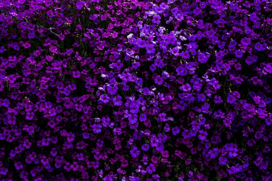
Purple is the most complex color on the color wheel. It is a combination of spiritual blue and sensual red, producing the “four Ps:” passion & piety, and the preacher & the prostitute.
Purple is highly spiritual and is perfectly at home in church vestments; however, it is equally at home in sexy lingerie.
Purple is the darkest color on the color wheel, making it appear somewhat veiled and mysterious. Perhaps for this reason, a number of cultures keep a distance from purple. The English say it is for little old ladies. Belgians believe only priests should wear it.
Not too many years ago, Americans often said that it was associated with prostitutes, so it was not considered a high-fashion color. The expression Purple Passion does give a clue to a part of this color’s personality.
Luckily, designer Yves St. Laurent came along and made purple a most chic and respectable color in the world of High Fashion. Perhaps he was remembering that purple is also the color of royalty.
Purple is popular among artists, and pale shades of the color are considered feminine. The color has a spiritual connotation and an association with royalty.
Long ago, only kings and priests were entitled to wear the color because the dye was so costly to produce.
Negative purple is erotic and vulgar. It is also the pretentious social climber, the would-be king.
Lavender is a softer version of purple but without the sensual connotation. Instead, lavender is usually associated with romantic and feminine types and is considered soft and delicate.
Pink
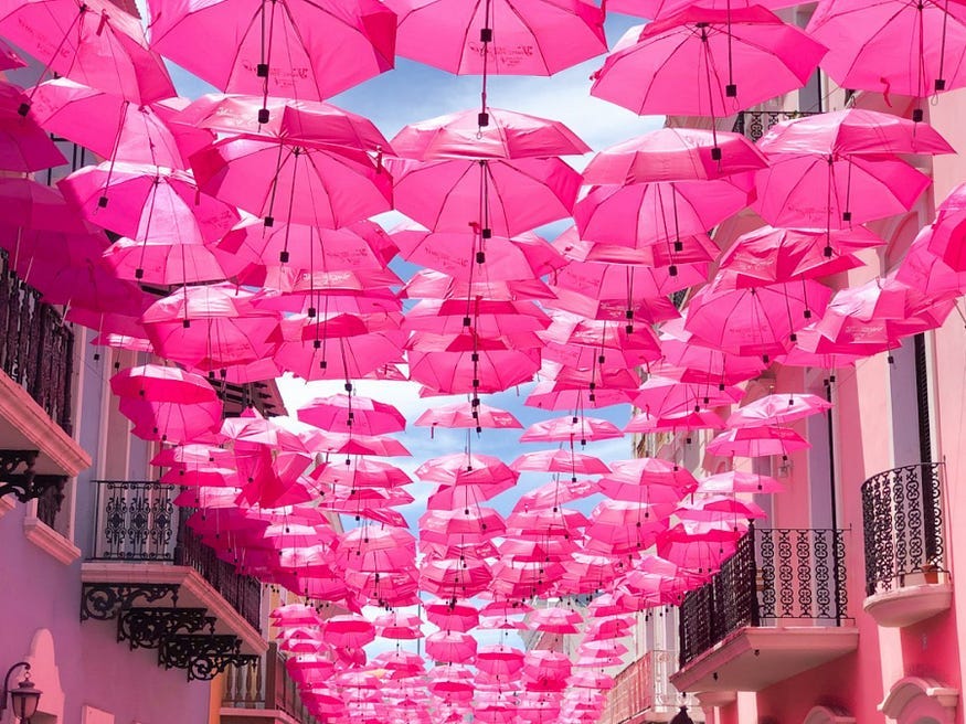
Pink is virtually a watered-down red, but without any of the negative connotations of red such as anger or aggressiveness. It is almost always thought to be soft and feminine.
Pink sends out the message that you are gentle, charming, and affectionate. Unlike purple, the color pink has no sexual or passionate connotations. It relates to romantic rather than physical love.
One thing Sandy always stressed is that we should not take this as a guide on which colors to wear. Rather, this is a guide to the message the colors you choose to wear might be sending to others. Some colors are intense and threatening, some are calming and reassuring, and some are soft and comforting. A true master of wardrobe planning neither uses color psychology to plan wardrobes nor ignores its implications.
Until next time, may your days be extra bright!
Love, Tatyana